Drag-and-Drop Slides
| Option | Description |
|---|---|
|
Layout field |
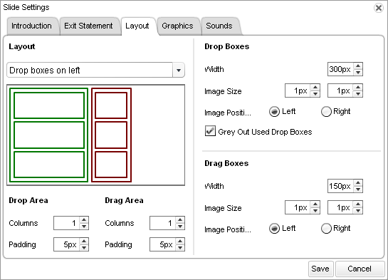
By default, the layout of the drag-and-drop slide displays the drop boxes on the left and the drag boxes on the right. If you want to change this layout, select one of the following options in the Layout field: Drop Boxes on Right or Drop Boxes on Bottom. |
|
Drop Area fields |
By default, the Drop Area contains one column, set with padding at 5 pixels. If you want to change the number of columns or the padding, type the desired values in the Columns and Padding fields. |
|
Drag Area fields |
By default, the Drag Area contains one column, set with padding at 5 pixels. If you want to change the number of columns or the padding, type the desired values in the Columns and Padding fields. |
|
Drop Boxes section |
By default, drop boxes are 300 pixels wide, images are set to the left of text, and the drop boxes that have been used are grayed out. If you want to adjust any of these settings, make the desired changes in the Drop Boxes section. |
|
Drag Boxes section |
By default, drag boxes are 150 pixels wide and images are set to the left of the text. If you want to adjust any of these settings, make the desired changes in the Drag Boxes section. |